Customizing Theme
Smartloop lets you bring your own theme and customize the look and feel of the app. A collection of open source themes is available in the studio-themes repository.
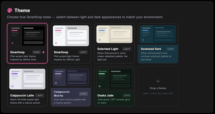
Available Themes
| Name | Mode | Description |
|---|---|---|
| Smartloop | dark light | Default theme with a pink accent |
| Solarized | dark light | Ethan Schoonover's classic low-contrast palette |
| Catppuccin Latte | light | Warm pastel light theme with a mauve accent |
| Catppuccin Mocha | dark | Cozy dark mocha palette with a mauve accent |
| Osaka Jade | dark | Jade-green CRT console glow on black |
Installing a Custom Theme
- Download the
.yamlfile you want from the studio-themes repository. - Open Smartloop Studio → Settings → Theme.
- Drop the file onto the Drop a theme tile (the dashed
+tile in the Theme grid).
The theme is imported, applied, and saved immediately — no restart required. Imported themes get a custom-* id so they never overwrite a built-in.
Authoring Your Own Theme
A theme is a single .yaml file. At minimum, you only need three colors — the app derives a full cohesive palette from your base background, brand accent, and text color:
name: My Theme
mode: dark            # "dark" or "light"
description: A short one-liner
colors:
  bg: '#282828'       # base background
  brand: '#fabd2f'    # accent color
  text: '#ebdbb2'     # primary text
For pixel-perfect control, you can override the full palette. Any value you provide is overlaid on the derived palette, so you only specify what you care about:
colors:
  bg:     { base: '', surface1: '', surface2: '', surface3: '', input: '', elevated: '' }
  brand:  { primary: '', hover: '', active: '', light: '' }
  text:   { primary: '', secondary: '', tertiary: '', muted: '', disabled: '', faint: '' }
  status: { error: '', success: '', online: '', warning: '', info: '', purple: '' }
  border: { subtle: '', default: '', hover: '', code: '' }
  table:  { head: '', hover: '', stripe: '', inlineCode: '' }
All colors must be 6-digit hex (#rrggbb).
Fonts (optional)
font:
  family: "'VT323', ui-monospace, monospace"   # required if font block is present
  heading: "'Press Start 2P', monospace"        # optional
  url: 'https://fonts.googleapis.com/css2?...'  # optional — must be https
Custom Rail Icons (optional)
Reskin the sidebar with your own inline SVGs. Use stroke="currentColor" or fill="currentColor" so icons inherit the rail's active/muted states. Supported keys: models, documents, mcp, skills, settings.
icons:
  models: '<svg width="18" height="18" viewBox="0 0 16 16" ...>...</svg>'
Note: Imported YAML is treated as untrusted — rail-icon SVGs are sanitized (
<script>,on*=handlers, andjavascript:URLs are stripped), and font URLs must usehttps.
Fork the studio-themes repository to peek into how each theme is built, and use it as a starting point for your own.
Contributing a Theme
Built something you're proud of? We'd love to include it! Just:
- Fork the studio-themes repository.
- Add your theme as
themes/<name>.yaml. - Add a row to the themes table in the README.
- Open a pull request — we'll happily review and merge it.